The best AI prompts for UI design specify the screen type, design system style, layout structure, and component details — like “mobile app dashboard, Material Design 3, card-based layout, bottom navigation bar, light mode.” These structured prompts generate realistic UI mockups that accelerate the design process.
UI/UX designers are using AI to rapidly prototype interfaces, explore design directions, and create presentation-ready mockups. This guide provides 20+ prompts covering web apps, mobile apps, dashboards, and landing pages.
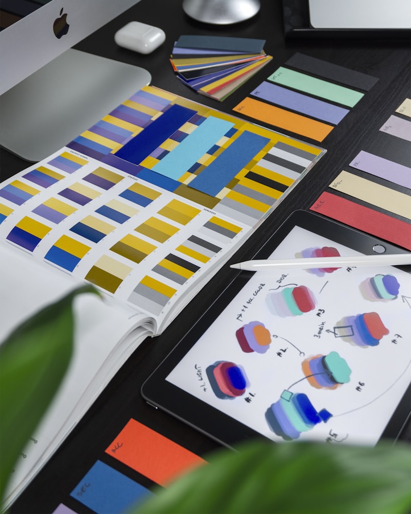
AI’s Role in UI Design
AI image generation complements (not replaces) the UI design workflow:
- Rapid ideation — Generate 20 layout concepts in the time it takes to sketch 2
- Style exploration — Test different visual directions quickly
- Client presentations — Show polished concepts early in the process
- Design system inspiration — Discover new component patterns and layouts
- Portfolio pieces — Create showcase-quality mockups
UI Prompt Structure
- Platform — Mobile app, web app, desktop, tablet, smartwatch
- Screen type — Dashboard, landing page, settings, profile, checkout
- Design system — Material Design, iOS Human Interface, custom
- Layout details — Grid, cards, sidebar, navigation placement
- Visual style — Light/dark mode, color scheme, typography
- Content hints — What kind of data or content is shown
- Material Design 3: Google’s system — “rounded corners, elevation shadows, dynamic color”
- iOS Human Interface: Apple’s system — “SF Pro typography, translucent blur, subtle gradients”
- Tailwind UI: “utility-first, clean components, neutral palette”
- Shadcn/ui: “modern React components, minimal, accessible”
- Ant Design: “enterprise, structured, data-dense, professional”
- Generate concepts — Use AI to explore layouts and visual directions
- Import to Figma — Use AI images as reference layers or backgrounds
- Build proper components — Create real, interactive components with proper spacing
- Add real content — Replace placeholder text with actual copy
- Test accessibility — Ensure contrast ratios, touch targets, and screen reader compatibility
- Create prototypes — Add interactions and user flows in Figma or similar
20+ UI Design Prompts
Mobile App Screens
mobile banking app home screen, Material Design 3, card-based layout showing account balance and recent transactions, bottom navigation bar, light mode, blue and white color scheme, clean modern UI, iPhone mockup --ar 9:19 --v 7fitness tracking app dashboard, dark mode, circular progress rings for steps and calories, weekly chart visualization, minimalist design, gradient purple accents, iOS style, phone screen mockup --ar 9:19 --v 7food delivery app restaurant listing screen, card grid layout, food photography thumbnails, ratings and delivery time, search bar at top, warm orange accent color, modern mobile UI design --ar 9:19 --v 7social media app profile page, profile photo and stats at top, grid of photo posts below, follow/message buttons, clean white background, Instagram-inspired layout, modern mobile UI --ar 9:19 --v 7meditation app home screen, calming gradient background blue to purple, daily streak counter, play button for guided sessions, minimal zen-like UI, soft rounded elements, wellness app design --ar 9:19 --v 7Web Application Dashboards
SaaS analytics dashboard, dark mode, sidebar navigation, multiple data visualization charts (line graph, donut chart, bar chart), KPI cards at top, modern data-heavy UI, clean professional design --ar 16:9 --v 7project management dashboard, Kanban board view with task cards, left sidebar with project list, header with search and user avatar, Trello-inspired layout, clean white UI, productivity app --ar 16:9 --v 7e-commerce admin dashboard, sales overview with revenue graph, recent orders table, inventory alerts, top products cards, modern admin panel design, blue and white color scheme --ar 16:9 --v 7CRM customer dashboard, contact cards grid, activity timeline, deal pipeline visualization, sidebar navigation, professional business software UI, clean and organized layout --ar 16:9 --v 7Landing Pages
SaaS landing page hero section, bold headline "Ship Faster", gradient background purple to blue, 3D illustration of app interface, CTA button, modern startup design, clean typography --ar 16:9 --v 7minimal startup landing page, large bold typography, single product screenshot, social proof section with logos, pricing table below, clean white design with accent color, professional web design --ar 16:9 --v 7creative agency landing page, split layout with large image and text, bold typography, dark moody aesthetic, portfolio grid section, modern web design, award-winning style --ar 16:9 --v 7AI tool landing page, futuristic dark design, glowing gradient accents, feature cards with icons, animated-style hero section, modern tech startup aesthetic, SaaS product page --ar 16:9 --v 7E-Commerce UI
luxury fashion e-commerce product page, large hero product image, minimal white space, elegant typography, size selector and add to cart button, premium shopping experience UI --ar 16:9 --v 7grocery delivery app category browse screen, colorful food category icons in grid, promotional banner at top, search bar, clean organized layout, fresh green accent color, mobile UI --ar 9:19 --v 7product checkout flow UI, multi-step progress indicator, form fields for shipping info, order summary sidebar, trust badges, clean conversion-optimized design, e-commerce web UI --ar 16:9 --v 7Settings & Forms
app settings screen, toggle switches for notifications, user profile section at top, organized grouped list layout, light mode, iOS Settings-inspired design, clean mobile UI --ar 9:19 --v 7multi-step registration form, progress stepper at top, clean input fields, dropdown selectors, modern form UI design, light grey background, blue accent color, professional web form --ar 16:9 --v 7Creative & Specialized
music streaming app now playing screen, album art prominently displayed, playback controls, progress bar, dark mode with gradient background matching album art, modern audio UI --ar 9:19 --v 7weather app interface, large temperature display, animated weather icon, hourly forecast horizontal scroll, beautiful atmospheric background, modern glassmorphism design, iOS weather app style --ar 9:19 --v 7smart home control app, room-based device grid, toggle switches for lights and thermostat, floor plan view option, clean minimal UI, modern IoT interface design --ar 9:19 --v 7AI chatbot interface, message bubbles, typing indicator, suggested quick replies, clean modern messaging UI, subtle gradient background, assistant app design --ar 9:19 --v 7Design System Keywords
Reference established design systems for consistent results:
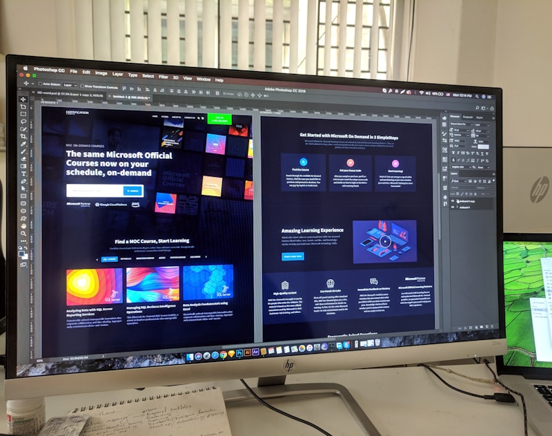
From AI Mockup to Production
AI-generated UI is a starting point, not a final product:
Frequently Asked Questions
Can I use AI-generated UI for actual products?
AI-generated UI should be used for inspiration and concepting, not directly in production. Real UI needs proper component architecture, responsive design, accessibility compliance, and interactive states that AI images cannot provide. Use AI as a visual reference, then build properly in design tools.
Which AI tool is best for UI mockups?
Midjourney produces the most visually polished results. For more structured wireframes, tools like Uizard, Galileo AI, and Figma AI are purpose-built for UI design and generate actual editable components rather than just images.
How do I get consistent UI across multiple screens?
Use –sref with a reference image of your desired design system. Keep color values, typography descriptions, and component styles consistent across all prompts. Build a prompt template with your design system tokens baked in.
Can AI replace UI designers?
No. AI accelerates the visual exploration phase but cannot replace the user research, information architecture, interaction design, accessibility expertise, and iterative testing that professional UI designers provide. AI is a powerful tool within the designer’s workflow, not a replacement for it.
What aspect ratio should I use for UI mockups?
Use –ar 9:19 for mobile screens (iPhone proportions), –ar 16:9 for desktop/web applications, –ar 4:3 for tablet views, and –ar 1:1 for individual component showcases. For full responsive mockups, generate multiple aspect ratios of the same design.